


For customers to complete an order, an online store must help them find a product, choose an available option, understand the total cost and receive clear confirmation of their purchase. Start your review with these tasks: follow the path from search to payment on a phone, deliberately make an error in the form, and check whether you can continue without re-entering all your details.
The steps below are practical recommendations for reviewing and improving your store. The advice on forms draws on educational materials from the World Wide Web Consortium (W3C), which explain accessible data entry, error checking and status messages. Use them as a technical reference for your developer and as a basis for reviewing your own website.

1. Check whether customers can find a product without help from a store manager
Ask someone to find a specific product without telling them which menu section to use. For example, ask them to find black sneakers in a particular size within a set budget. Watch which category names they choose, what they type into search and where they get stuck. If the customer opens several irrelevant sections, review your category names and structure.
Name categories using the words customers use to describe products when contacting your store. A supplier’s internal group names may be unfamiliar to visitors. Show the product’s category path on its page, and preserve selected filters and the customer’s position in the list when they return from the product page so they can continue comparing from where they left off.
- Search. Check searches by product name, SKU, part of a name and common spelling variations. If your store supports typo correction or synonyms, test these with real customer queries.
- Filters. Show the attributes that help customers choose within that category: size for shoes, connector type and length for a cable. Display active filters and let customers remove each one individually.
- No results. Keep the search query and explain what customers can change. If a particular combination of filters returns nothing, offer to clear a specific restriction.
- Buttons and icons. Add clear labels to important actions, such as “Search,” “Cart” and “Clear filters.” Check whether people understand what a button does before they click it.
Check the mobile menu separately. Customers should be able to open a category with a tap, and its subcategories should remain available without hovering. When customers close the menu, return them to the same place on the page where they opened it.
2. Match the product option, stock, price and dispatch time
Check availability for each specific combination of product attributes. If a model is in the catalog but the black version in the required size is unavailable, a general “In stock” message does not help customers make the right choice. After a customer selects an option, the product page should show the corresponding photos, price, available quantity or status, and dispatch time.
Ask your developer to check availability both when an item is added to the cart and before the final confirmation. If the stock has changed, the site should explain which item is unavailable and preserve the rest of the cart. Any change to color, size or configuration requires the customer’s explicit choice.
| Situation | What to show the customer | What the store owner should check |
|---|---|---|
| Option unavailable | A label next to the size or color, and a way to select an available option | Whether the cart automatically adds a different attribute |
| Product available to order | A separate status, expected time frame and confirmation process | Whether checkout shows the standard warehouse dispatch time |
| Price depends on configuration | The updated price after selection and a list of components | Whether the product page, cart and order total match |
| The required quantity is no longer available | The available quantity and an offer to change the order | Whether other products and delivery details have been preserved |
If a manager must confirm availability separately, tell customers before checkout. Do not promise immediate dispatch while the store is still checking with a supplier. Make sure the website’s wording matches what your staff can actually do.

3. Show the full cost before final confirmation
Customers should understand the product price and any costs added by their chosen delivery and payment methods. Show the known amount or explain how it is calculated next to the delivery method. If the exact rate depends on the address, weight or dimensions, explain this and update the calculation once you have the required details.
Illustrative calculation: Two products at UAH 480 each cost UAH 960. With UAH 80 for delivery and UAH 20 for packaging, the total cost is UAH 1,060. If the customer pays UAH 960 to the store and UAH 100 upon receipt, the summary should show both amounts and who receives each payment. These figures illustrate the structure of the calculation only.
Check how the total changes when customers apply a promo code or choose another carrier or payment method. Show the products, discount, delivery, other agreed costs and total as separate items. If any component is not yet known, label it clearly and explain when the customer will learn the exact amount. The total should not look final if it covers only the products.
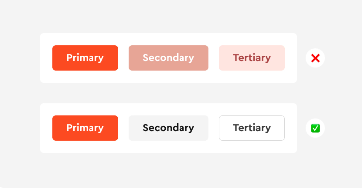
Example of visually distinguishing actions. The contrast and accessibility of specific buttons should be checked separately.
4. Shorten the mobile form and make every field clear
Review each required field with the manager who processes orders. Find out what action requires each piece of information. For delivery to a parcel branch, there is no need to require a street and apartment number; for store pickup, a full postal address is unnecessary. Show additional fields only after the customer selects the relevant delivery method.
As a practical improvement, let customers order without creating an account. Offer registration after the purchase is confirmed and explain its benefit, such as access to order history. Also check the case where the email address is already in your database: password recovery should not be the only way to continue guest checkout.
The W3C guidance on form labels recommends labeling form controls and associating each label with its corresponding field. Ask your developer to keep the labels “Phone,” “Email address” and “City” visible after customers enter their details. Placeholder text inside an empty field disappears, so customers may lose the explanation of what they are filling in.
- Field type. Set the email field to type email and the phone field to tel. Store phone numbers as text so the “+” sign and number format are not treated as arithmetic values.
- Autofill. Ask your developer to set the autocomplete attribute according to each field’s purpose, and test name, phone and address autofill on a real phone.
- Input format. Allow phone numbers to be pasted with spaces or parentheses, and handle acceptable variations on the site. In its input validation guidance, W3C recommends accepting different ways of entering data where possible.
- Required fields. Mark required fields with words, or explain what the marker means before the form. Optional fields should also be clearly identifiable.
For a Ukrainian store, the fields you collect are also subject to Ukrainian law. Part 3 of Article 6 of the Law of Ukraine “On Personal Data Protection” No. 2297-VI requires personal data to be relevant, adequate and not excessive in relation to the purpose of processing. In practice, check whether you need a date of birth, gender and other details that are not necessary for a particular order.
Paragraph 3 of Part 1 of Article 11 of this Law provides for entering into and performing a legal transaction as one of the grounds for processing data. Therefore, determine the legal basis separately for each purpose; consent is not the only possible basis for processing an order. Next to the form, provide a clear link to information about the data controller, the purpose of processing, recipients and how to make a request about personal data, taking account of the rights set out in Article 8. If you ask customers to consent to marketing emails, offer that separately from checkout.
Check keyboard access, focus visibility and readability
Complete checkout without a mouse: use Tab to move forward, Shift+Tab to move back, and activate buttons and open lists from the keyboard. Focus, meaning the indicator of the currently active element, should be visible. The tab order should follow the reading order, and an open menu or dialog should not leave customers without a way to return to their purchase.
On a phone, check the form with the on-screen keyboard open: the active field, hint and error message should remain visible. Zoom in on the page and read the option labels and delivery terms. If text is cut off, buttons cover fields or nearby elements are hard to tap separately, record the specific screen and action that needs fixing.
5. Explain errors and preserve entered data
A message such as “Invalid data” forces customers to find the problem on their own. State which field needs attention and how to fix it: “Enter the delivery branch” or “Check your email address: there must be a domain name after @.” Associate the message with the relevant field and keep it visible while the customer corrects their entry.
W3C guidance on form notifications recommends clear error explanations, a list of problems before the form and links to the relevant fields. If a form has several errors, ask your developer to provide such a list, visible explanations next to the fields and an accessible notification of changes for people who use screen readers. A red outline alone does not explain how to fix an error.
Deliberately leave the delivery branch blank, enter an incorrect email address and submit the form. Make sure the site preserves the products, quantity, contact details and options already selected. After correcting the error, customers should be able to continue checkout with their existing details. Also check going back to the previous step and recovering after a temporary network outage; saved data should not be exposed to another user on a shared device.
Browser validation helps show errors quickly, but as W3C explains in its input validation guidance, data must also be checked on the server. Include both layers of validation in the developer’s task. Also recheck order-critical values—price, availability, quantity and discount application—on the server before confirmation.
6. Let customers review the order and recover payment without creating a duplicate
Before the final action, show the order contents, including product attributes, quantity, total, contact details, address and payment method. Let customers change each section without clearing the others. The W3C recommendations on error prevention also provide for reviewing and correcting information before purchase.
Label the final button according to the next action: “Confirm order” if the site creates an order, or “Proceed to payment” if it opens a payment page. After the customer clicks, show that the request is being processed. Protection against repeated clicks must work together with server-side protection: resubmitting the same request should return the order that has already been created instead of creating another one.
| Result | What to tell the customer | What action to offer |
|---|---|---|
| Order created, payment not yet made | Order number and “Awaiting payment” status | Pay for this order or contact the store |
| Payment confirmed | Order number, amount paid and next processing step | View the order and support contacts |
| Payment declined | Confirmed failed attempt status and current order status | Retry payment for this order or choose another available method |
| Payment response not yet received | That the store is checking the result | Check the status or contact the store with the order number |
Returning from a payment page should not by itself determine whether payment succeeded. Ask your developer to receive and verify the result through the mechanism provided by the payment service. If a customer closes the tab or loses their connection, the site should restore the state of the existing order. While the result is unknown, do not prompt the customer to pay again or say that funds were not charged without confirmation.
Check double-clicking, refreshing the confirmation page and returning with the browser’s Back button. For each check, compare the number of orders in the system, their numbers and the payment attempts. A visible “Successful” message must match the actual outcome; W3C also emphasizes that users should be notified when a form is completed successfully as well as when errors occur.
7. Make delivery terms, returns and contact details available before purchase
Show a brief summary near the product and during checkout, and put detailed explanations on separate pages with prominent links. Customers should be able to find an answer before confirming their order and return to checkout without losing entered details.
- Delivery. List available methods, service areas, how the cost is determined and processing times. Distinguish the time the store needs to dispatch an order from the expected transit time.
- Returns. Explain where customers should contact you, what details to provide to find their order, how to arrange a return shipment and when to expect a response. Check terms and exceptions for your product range; do not apply restrictions for one product type to all purchases.
- Contact details. Name the seller, show contact channels and response hours. Check that phone and email links work on a mobile device.
- Store pickup. If available, list the address, opening hours and when customers can arrive: immediately after placing an order or after receiving a ready-for-pickup notification.
Ask the manager to check these pages against the actual workflow. If the site promises a response within a certain time, staff should know who handles inquiries and what to do in their absence. Update both the customer instructions and the inquiry handling process.
Torgsoft synchronization with an online store: checking stock and prices
If Torgsoft is your primary inventory management system, the additional paid “Online Store Synchronization” feature lets you transfer product data, availability, attributes and descriptions, and receive orders. According to the official license comparison, synchronization requires a license with full functionality and the corresponding paid option. Connecting your own website requires the involvement of its developer, as stated in the Torgsoft Help Center.
Before launch, agree on which stock locations will send their quantities to the site, which price source will be used for invoices, the reservation rules and the attributes to be transferred. The “Synchronize only in-stock products” filter removes products with zero or negative quantities from the site, so check the effects on product pages and links separately. For the automatic mode described in the data exchange setup guide, set the interval to no more frequently than once every 10 minutes, taking other synchronized objects into account. Keep Torgsoft running on the designated computer under the specified user. This exchange does not mean stock is updated on the website instantly.
To check the setup, make a test sale, wait for synchronization and verify the specific product option on the site. Then place a test order and check that it has been imported, along with its quantity, price, reservation and payment status in the inventory system. Check synchronization errors in the log. According to the Help Center, during automatic order import, a payment creation error may leave the invoice unpaid and add an entry to the error log. Synchronization transfers data; field labels, navigation, notifications and protection against duplicate orders must be configured and checked separately on the website.
8. Test with customers and review completed orders
Invite people who buy products in your category and ask them to complete tasks without explaining where the buttons are. Use a test payment mode agreed with your developer. Ask participants to say what they expect as they go, then ask where they felt unsure and what information was missing.
- Find a product through a category and then through search, select the required attributes and check availability.
- Add the product to the cart, change the quantity, remove an item and return to the catalog.
- Place an order on a phone without registering, identify all costs and change the delivery method.
- Correct a deliberate form error and make sure the other details are preserved.
- Complete successful and failed test payments, return to the order and check its status.
- Find the returns process and store contact details without losing the cart.
Record the task, device, point where the customer got stuck, what they said and the result: completed independently, completed with help or not completed. In the developer’s task description, include the action, expected result and actual behavior. For example: “After the city is changed, the form keeps the branch from the previous city; clear that selection and ask the customer to choose a new one.”
First fix issues that prevent customers from buying, cause an incorrect total, lose data or create a duplicate order. After each fix, repeat the task that exposed the problem and check the steps around it. Track changes using consistently defined measures: successfully submitted checkout forms, orders created, payments confirmed, orders fulfilled, cancellations and returns. Clicking a payment button does not mean a purchase has been completed, and a fulfilled order may later be returned.
Compare the measures with specific errors and customer feedback. If more customers complete their orders after changes, also check for changes in traffic, prices, advertising and product availability before attributing the result to the interface alone. For the next review, keep a list of unresolved barriers, the staff responsible and a clear acceptance condition for each fix.


 Go back to the previous step